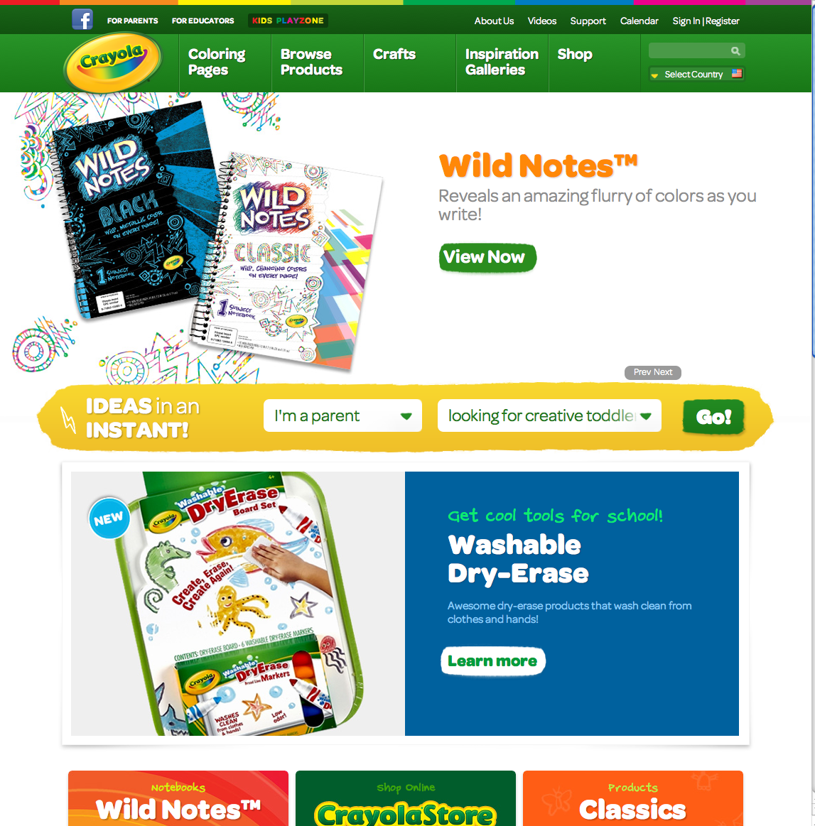
I was searching for websites for that class, I was supposed to find two I liked and one I didn't. I thought that the Crayola and National Geographic were good websites. They are very well designed and easy to navigate through. The design assists the view in finding their way through the website. They both have a cohesive design throughout all the pages. The colors used are perfect for the topic and intended audience.
I last website I found is AWFUL. There is way too much going on. The design aspects do not work well together. The design actually distracts away from the website. The moving pieces of the homepage is hard to find what you are looking for. The background is overall too flashy.


No comments:
Post a Comment