
Monday, December 2, 2013
Coffee Carrier
Advertisements
Today while I was perusing Pinterest, I came across some very clever fitness advertisements. These advertisements were on everyday, commonly used items. It is interesting to see advertisements like these. Other advertisements I have seen simply put the name of the company out there. These pieces are conversation starters, making them so much more effective.
Check them out! http://www.boredpanda.com/fitness-and-yoga-ads/
Check them out! http://www.boredpanda.com/fitness-and-yoga-ads/
Tuesday, November 26, 2013
Music posters
Our newest project for Typography is to create a music poster. At first I was not really sure of what direction I wanted to go, but as I was looking for inspiration, I feel in love with simplistic designs. I know that my design will not end up being simple because I can not seem to ever keep it simple.

I found this image when I was browsing the internet and I think it is great because of how straight forward it is.
I found this image when I was browsing the internet and I think it is great because of how straight forward it is.
Monday, November 25, 2013
Final Project
For my final project, I want to create a magazine spread in
InDesign. I am going to steal the project from Sarah’s typography class. I want
to create a 4 page spread including: pull quotes, images, and a story. I want
to create a spread based on an interview of a famous someone (Subject to
change). My audience is going to be
young adults. I want to choose someone that is relevant to the young adult
world. For the final project I want to submit a digital rough of my spread. I
would eventually like to print the spread and out it together, but I think in
the time we have left I would rather focus on my design than the technical
aspects of printing it out and putting it together. Realistically in the two
weeks we have left, it is going to be challenging to create and design four
pages.

Milwaukee Skyline
Here is our InDesign project of the Milwaukee skyline. We created the shapes and filled them with facts about each shape. The sun is filled with facts of the sun, the skyline the fact of Milwaukee and so on. I really enjoyed this project, but I was often frustrated with Indesign. There were many instances that I had an idea in my head, but I didn't know how to do it. I am happy to be a little bit more experienced in InDesign.


Wednesday, November 13, 2013
InDesign Practice
This semester was the first time I have really used InDesign. There are a lot of really great tools in InDesign. It is similar to Photoshop and Illustrator in many ways.

Here is what I have done for our first practice. I tried to incorporate everything we learned in class. I could not figure out how to get a better variety of swatches. I really like that there is a place holder text option. It makes it very easy to get your design done first.

Here is what I have done for our first practice. I tried to incorporate everything we learned in class. I could not figure out how to get a better variety of swatches. I really like that there is a place holder text option. It makes it very easy to get your design done first.
Tuesday, November 5, 2013
Portfolio Website
Who thought this day would ever get here? The day where we can say we are finally done with the midterm project! Now that I have completed this project, I have a greater appreciation for Dreamweaver. I never thought I would figure it out, and it turns out the more I struggled with it the more I actually learned. I am very happy with the final result. The only thing I am not happy about are the blue lines around my images when I open the home page on the web. I am not sure how they got there or what happened.
Here is the url to my website: http://artweb.stritch.edu/kaspillane/Art202/
Here is the url to my website: http://artweb.stritch.edu/kaspillane/Art202/
Saturday, October 26, 2013
Packaging

Friday, October 25, 2013
Nature's Beauty
This is a picture of a bird that really caught my eye. I love the beautiful colors it has. It is great to be reminded that there is such beauty in nature. It is great to think that we do not need to create beauty it is always around us. It is important to remember to take the time to recognize the beauty around us.


Thursday, October 17, 2013
What?

Type and Image

Harley Davidson
At the Harley Davidson Museum there is an exhibit called Design Lab. It is an instillation shows how the ideas and designs have evolved. The exhibit has frosted walls and inside there is everything from sketches to full clay prototypes of different motorcycles. I think this is a great exhibit to show the process behind the machine. It is easy to love the look and design of Harley Davidson, but it is important to remember the amount of work that has been put into each and every machine. http://www.harley-davidson.com/en_US/Content/Pages/HD_Museum/explore/exhibits/design-lab.html
Wednesday, October 16, 2013
Sketch
Sketching is something I wish I had patience to do. I doodle often but it is nothing of this sort. I like to draw but when it doesn't look exactly like I imagined it I get frustrated and give up. I know that I need to improve my drawing skills, as well as my ability to work with what I do. I want to try this idea of sketching with colored pencils as well. I think it makes the sketch more fun and exciting. Maybe I will be able to stay focused if I make it more fun.

Mock up Website
Here is the ROUGH mock up of my website so far. The red and black squares on the homepage are just place holders until I have all of my images at the correct size and ready to go. The homepage is going to be set up as a media splash with top navigation as well. The other pages are pretty straight forward. I am still coming up with the content for the about page so that has fillers as well.


Wednesday, October 9, 2013
Portfolio Site Feedback
Today in class did a small group in process critique. I think it was very helpful for me to talk through my own design so I can pick parts of my design that are not clear and focus on those moving forward. My group discussed combining my about page and my artist statement page. I really like this idea because they are basically the same information, and it would make more send for the viewer to have them together. We also talked about treating my gallery page like a "homepage" for the gallery. I think this makes sense and would be an easier way to organize my projects. I know as I start to sketch out my pages my ideas will become much clearer. I think it is important to have your ideas clearly planned out before you start. My group asked some great questions to get me thinking about the details of my pages.
Monday, October 7, 2013
Gliffy
Today in Art 202, We worked on organizing our ideas. For my website I plan to create a portfolio. I plan to incorporate artist statement, blog, gallery, and an about me. I plan to have each page connect to every page. Each page will also have a top navigation. The home page will have a top navigation, a media splash and a bottom navigation. Gliffy made this process very easy to for me. I am a very visual person, an it was easier for me to see what my ideas really looked like in Gliffy. It is easier to critique my own idea when they are clearly planned out in front of me. If only all planning was this easy!


Wednesday, September 25, 2013
Holi Festival of Colors
The Holi Festival is a celebration in India. The festival has many purposes. They are celebration a new season, Spring. The Hindus believe it is a time to enjoy the colors of Spring and say good bye to Winter. The festival also has religious purposes. During the festival there are bonfires, wild celebrations, and an event where they throw colored powder at each other.
The part that I found most interesting was the color fight. I thought it was very interesting that this piece of their celebration has moved into other cultures. The aspect of color is very appealing to all cultures. In our culture we have even added color to our athletic events. The Color Run is becoming more and more popular throughout the Unites States.


The part that I found most interesting was the color fight. I thought it was very interesting that this piece of their celebration has moved into other cultures. The aspect of color is very appealing to all cultures. In our culture we have even added color to our athletic events. The Color Run is becoming more and more popular throughout the Unites States.


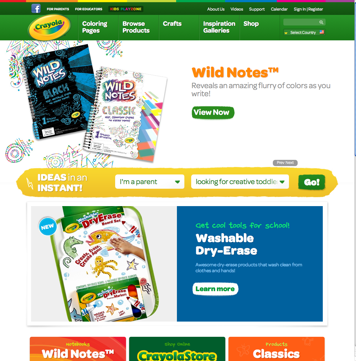
Website Design
I was searching for websites for that class, I was supposed to find two I liked and one I didn't. I thought that the Crayola and National Geographic were good websites. They are very well designed and easy to navigate through. The design assists the view in finding their way through the website. They both have a cohesive design throughout all the pages. The colors used are perfect for the topic and intended audience.
I last website I found is AWFUL. There is way too much going on. The design aspects do not work well together. The design actually distracts away from the website. The moving pieces of the homepage is hard to find what you are looking for. The background is overall too flashy.


Tuesday, September 17, 2013
iPhone
Last week the new iPhones, 5c and 5s, were released. I was very excited when I heard the rumors about what was to come. The day the were released I looked them up online and there were very minimal differences. One of the main differences in the new phones is the color. There are also a few new design changes. I found it very interesting that so many people were overly excited completely based on the color of the phone. Design highly impacts people's view on a product. Many people only want the product only because it has a small white apple on it. Apple's brand is so iconic everyone wants it. There are many brands out there that have better products, but still can not compete with Apple.
Monday, September 16, 2013


Thursday, September 12, 2013


Monday, September 9, 2013
Type TYPE tYpE
This year I am learning about the world of typography. I never knew there were so many characteristics to a single letter. I really enjoy learning this new information. I like looking at font and seeing so much more! I find myself criticizing type everywhere I go. I am constantly comparing and advertisements, and questioning why the designer chose what they did. It strengthens my own understanding of the characteristics if I continuously look for them. I am excited to continue learning new information about typography.


Wednesday, September 4, 2013
Introduction
Hey everyone! I am Kylee. This is my sophomore year at Stritch. I am excited to continue moving through the graphic design program! My high school was fairly small so we did not have classes using specifically Dreamweaver and Indesign so I am excited to learn beyond what I have taught myself!
Subscribe to:
Posts (Atom)